Baroque Color Guide - Barberini and Corsini
Read Baroque color with confidence: palettes, hierarchy, saturation shifts, and emotional cues in Barberini and Corsini.
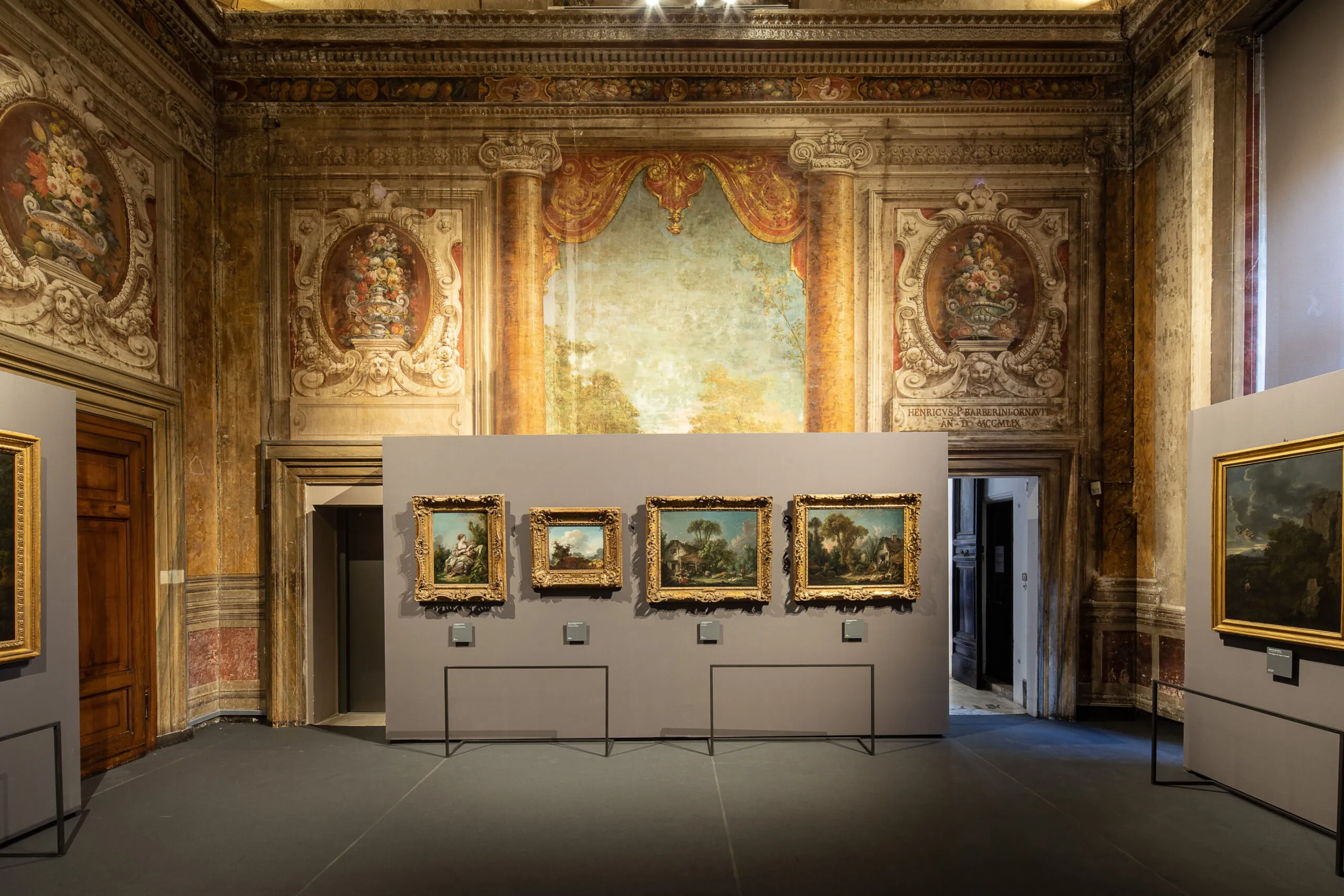
Visitors often describe Baroque color as rich or dramatic, but those adjectives remain vague. A better approach is to treat color as grammar: choices of hue, saturation, and contrast structure meaning as clearly as composition does.
Three core color functions
- Hierarchy: color intensity can mark what matters most.
- Affect: warm-cool dynamics shape emotional temperature.
- Transition: palette shifts can move a narrative between tension and resolution.
Practical room exercise
- Choose one work with strong reds.
- Choose a nearby work dominated by earth tones.
- Compare where each artist places chromatic emphasis.
Palette notation mini-system
D = dominant hue
A = accent hue
C = contrast trigger
M = mood outcome
Example note
D: umber + muted gold
A: vermilion drapery
C: cool gray background
M: controlled authority with latent tension
Color does not merely decorate subjects; it governs how subjects are felt.
By repeating this system across three rooms, your eye quickly shifts from passive admiration to active interpretation.
关于作者

Rome Art Desk
这份指南旨在让巴贝里尼宫对不同类型访客都更易接近、更有意义、也更易享受——无论你是第一次进入巴洛克博物馆,还是已经对艺术有深入兴趣。我们把实用建议与历史叙事结合,希望让这次参观不仅“好看”,更真正“值得记住”。在这里,每一间厅室都不只是年代标签,而是在讲述权力、象征、城市与记忆如何交织。
Tags
Comments (0)
Loading comments...