Baroque Color Guide - Barberini and Corsini
Read Baroque color with confidence: palettes, hierarchy, saturation shifts, and emotional cues in Barberini and Corsini.
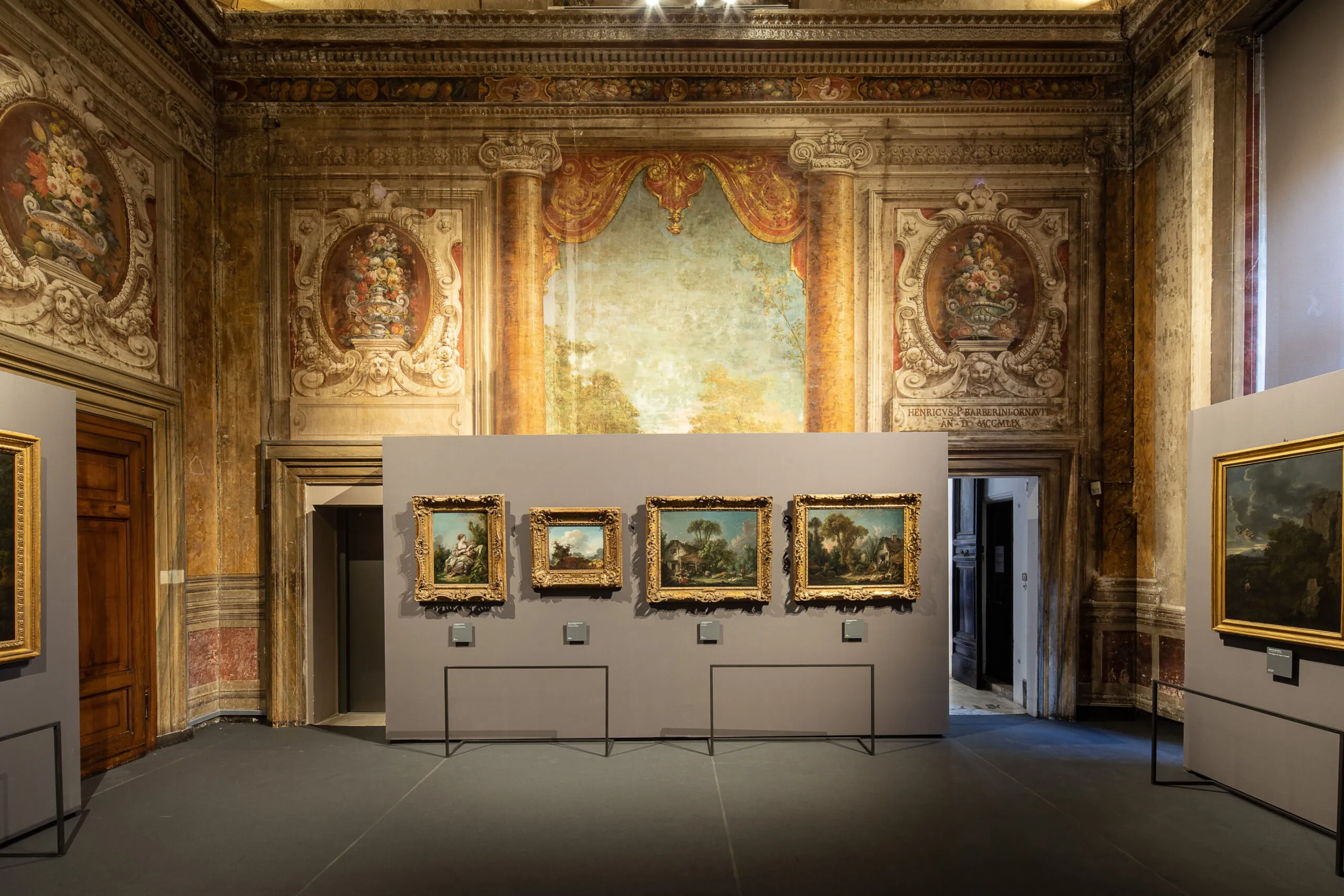
Visitors often describe Baroque color as rich or dramatic, but those adjectives remain vague. A better approach is to treat color as grammar: choices of hue, saturation, and contrast structure meaning as clearly as composition does.
Three core color functions
- Hierarchy: color intensity can mark what matters most.
- Affect: warm-cool dynamics shape emotional temperature.
- Transition: palette shifts can move a narrative between tension and resolution.
Practical room exercise
- Choose one work with strong reds.
- Choose a nearby work dominated by earth tones.
- Compare where each artist places chromatic emphasis.
Palette notation mini-system
D = dominant hue
A = accent hue
C = contrast trigger
M = mood outcome
Example note
D: umber + muted gold
A: vermilion drapery
C: cool gray background
M: controlled authority with latent tension
Color does not merely decorate subjects; it governs how subjects are felt.
By repeating this system across three rooms, your eye quickly shifts from passive admiration to active interpretation.
저자 소개

Rome Art Desk
이 가이드는 처음 바로크 미술관을 찾는 여행자부터 깊이 있는 감상을 원하는 애호가까지, 누구나 팔라초 바르베리니를 더 가깝고 의미 있게 즐길 수 있도록 만들었습니다. 실용 정보와 역사 서사를 자연스럽게 연결해, 방문이 단순한 관람을 넘어 오래 기억되는 문화 경험이 되도록 돕는 것이 목표입니다. 이곳의 각 방은 연대 표지를 넘어 권력, 상징, 도시, 기억이 어떻게 얽히는지를 생생하게 들려줍니다.
Tags
Comments (0)
Loading comments...