Baroque Color Guide - Barberini and Corsini
Read Baroque color with confidence: palettes, hierarchy, saturation shifts, and emotional cues in Barberini and Corsini.
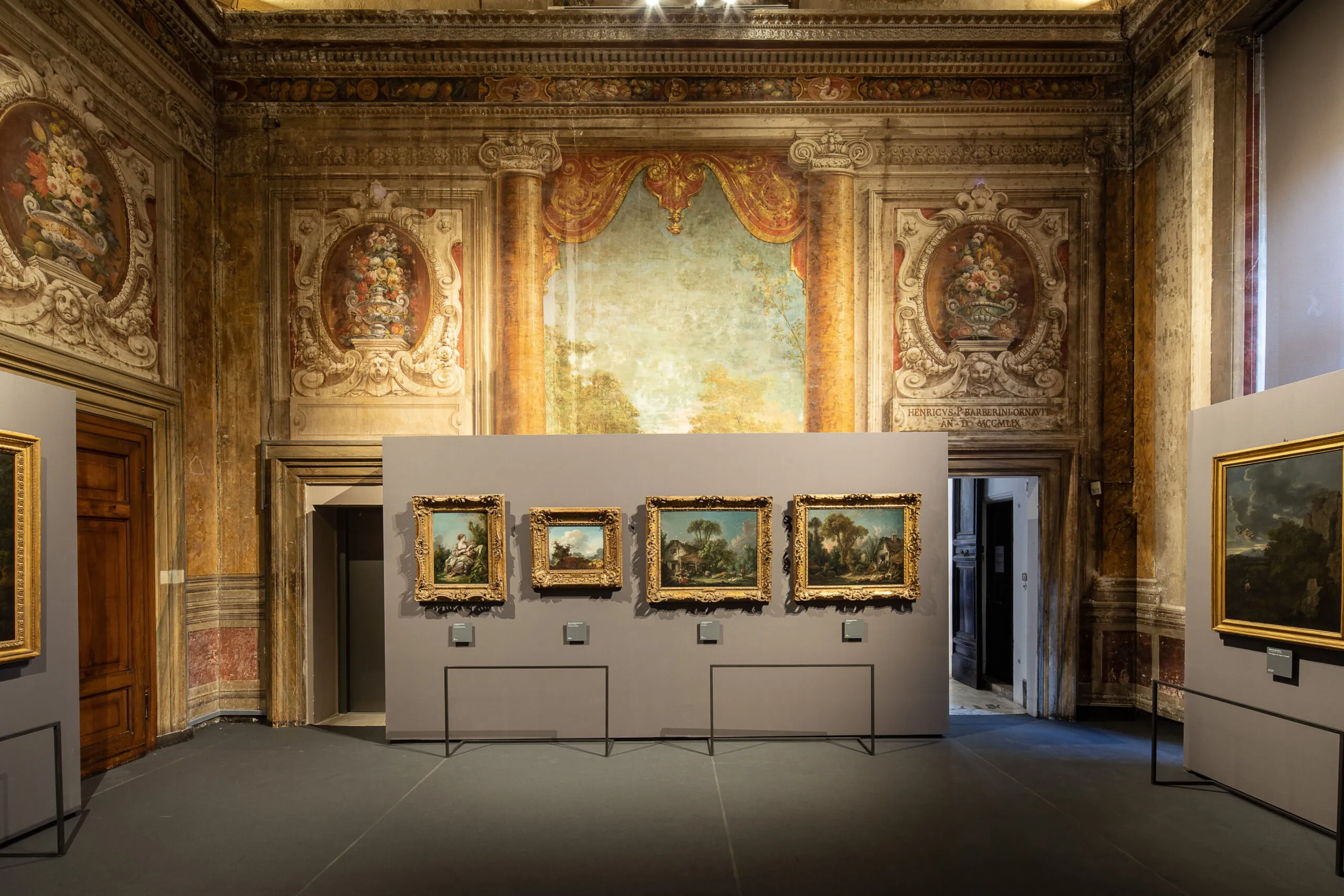
Visitors often describe Baroque color as rich or dramatic, but those adjectives remain vague. A better approach is to treat color as grammar: choices of hue, saturation, and contrast structure meaning as clearly as composition does.
Three core color functions
- Hierarchy: color intensity can mark what matters most.
- Affect: warm-cool dynamics shape emotional temperature.
- Transition: palette shifts can move a narrative between tension and resolution.
Practical room exercise
- Choose one work with strong reds.
- Choose a nearby work dominated by earth tones.
- Compare where each artist places chromatic emphasis.
Palette notation mini-system
D = dominant hue
A = accent hue
C = contrast trigger
M = mood outcome
Example note
D: umber + muted gold
A: vermilion drapery
C: cool gray background
M: controlled authority with latent tension
Color does not merely decorate subjects; it governs how subjects are felt.
By repeating this system across three rooms, your eye quickly shifts from passive admiration to active interpretation.
著者について

Rome Art Desk
このガイドは、初めてバロック美術館を訪れる方から、より深い鑑賞を求める方まで、誰にとってもパラッツォ・バルベリーニを“分かりやすく、近く、意味のある場所”にするために作られました。実用情報と歴史叙述を自然に結び、見学を単なる“美しい体験”で終わらせず、長く記憶に残る文化体験へ導くことを目指しています。ここでは各部屋が年代を示すだけでなく、権力・象徴・都市・記憶の絡み合いを語っています。
Tags
Comments (0)
Loading comments...