Baroque Color Guide - Barberini and Corsini
Read Baroque color with confidence: palettes, hierarchy, saturation shifts, and emotional cues in Barberini and Corsini.
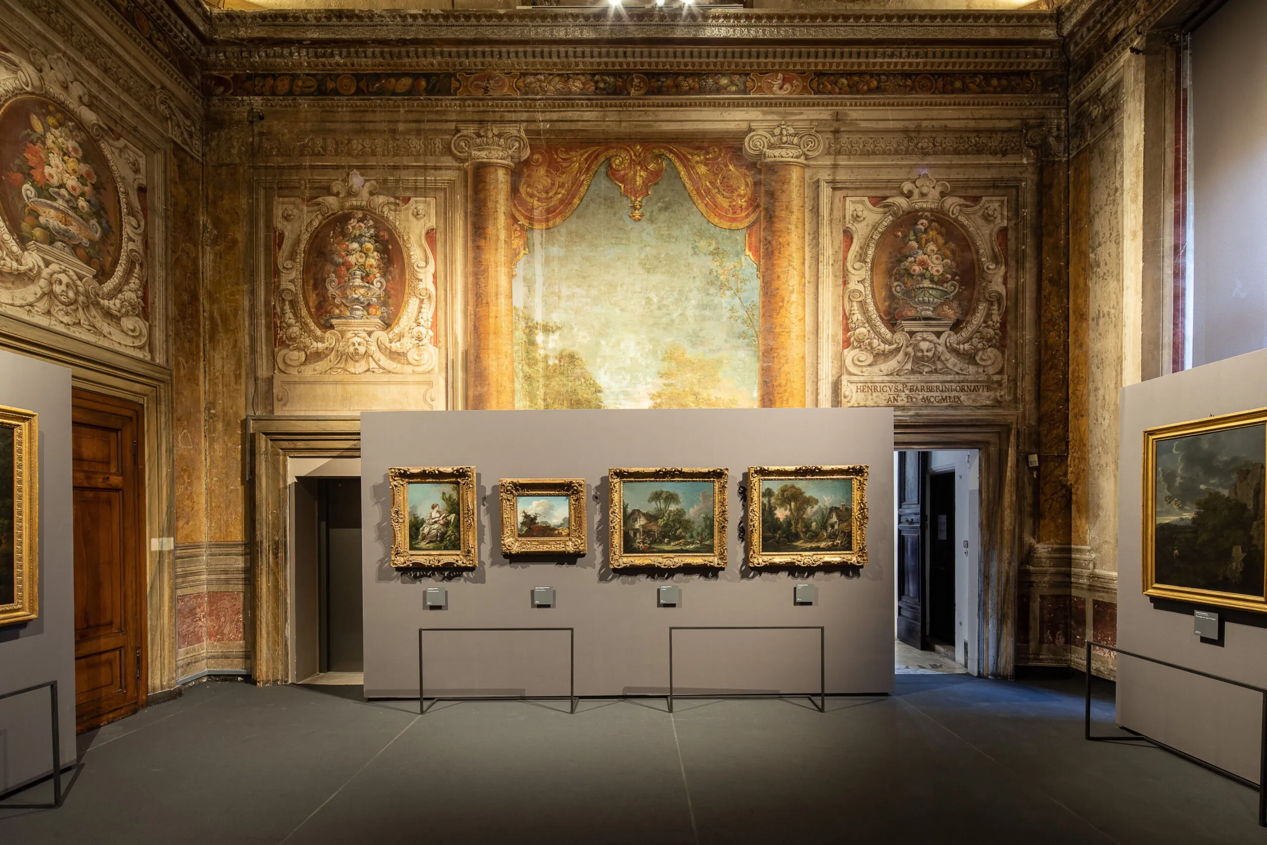
Visitors often describe Baroque color as rich or dramatic, but those adjectives remain vague. A better approach is to treat color as grammar: choices of hue, saturation, and contrast structure meaning as clearly as composition does.
Three core color functions
- Hierarchy: color intensity can mark what matters most.
- Affect: warm-cool dynamics shape emotional temperature.
- Transition: palette shifts can move a narrative between tension and resolution.
Practical room exercise
- Choose one work with strong reds.
- Choose a nearby work dominated by earth tones.
- Compare where each artist places chromatic emphasis.
Palette notation mini-system
D = dominant hue
A = accent hue
C = contrast trigger
M = mood outcome
Example note
D: umber + muted gold
A: vermilion drapery
C: cool gray background
M: controlled authority with latent tension
Color does not merely decorate subjects; it governs how subjects are felt.
By repeating this system across three rooms, your eye quickly shifts from passive admiration to active interpretation.
Tentang penulis

Rome Art Desk
Panduan ini dibuat agar Palazzo Barberini terasa dekat, bermakna, dan mudah dinikmati oleh semua jenis pelancong—dari pengunjung pertama kali hingga pecinta seni yang mendalam—dengan menggabungkan saran praktis dan kisah-kisah yang menjadikan istana ini tak terlupakan.
Tags
Comments (0)
Loading comments...