Baroque Color Guide - Barberini and Corsini
Read Baroque color with confidence: palettes, hierarchy, saturation shifts, and emotional cues in Barberini and Corsini.
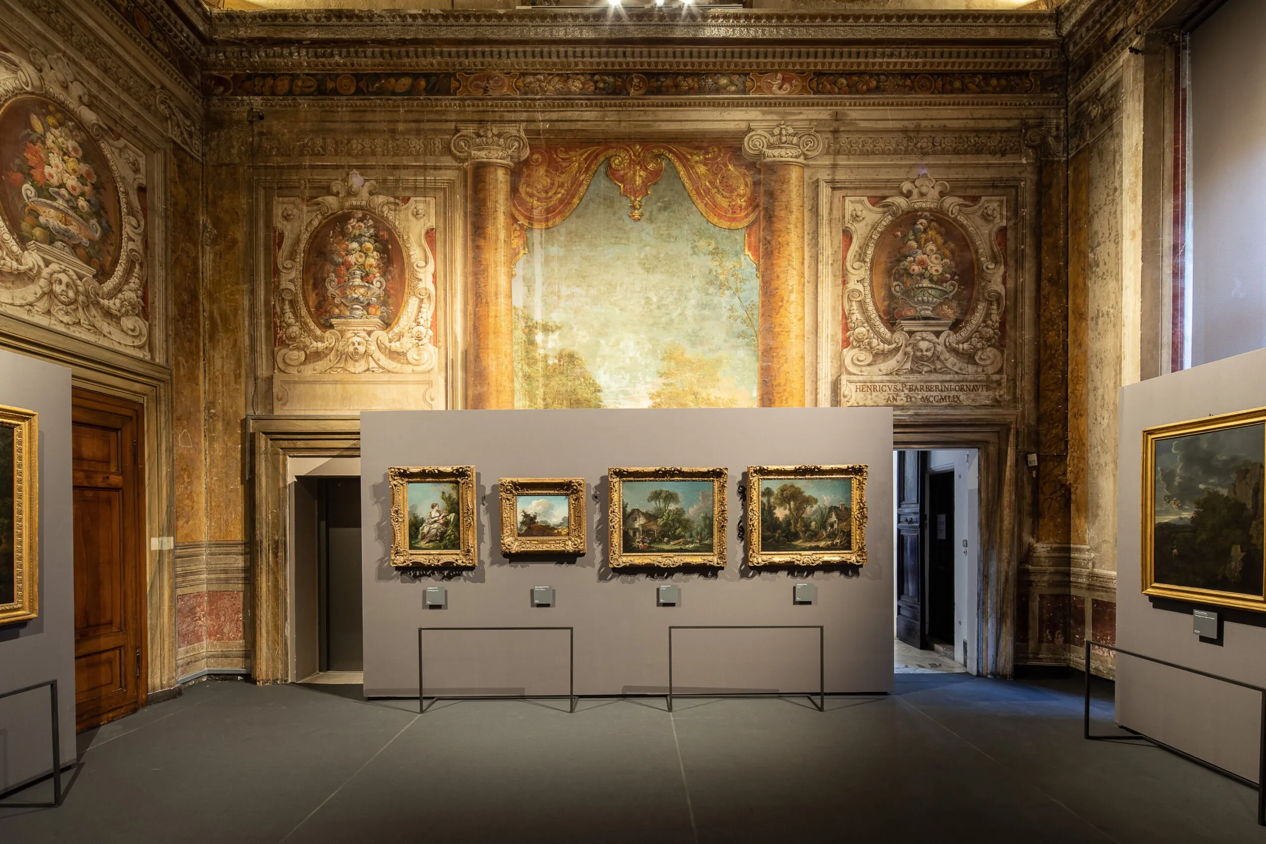
Visitors often describe Baroque color as rich or dramatic, but those adjectives remain vague. A better approach is to treat color as grammar: choices of hue, saturation, and contrast structure meaning as clearly as composition does.
Three core color functions
- Hierarchy: color intensity can mark what matters most.
- Affect: warm-cool dynamics shape emotional temperature.
- Transition: palette shifts can move a narrative between tension and resolution.
Practical room exercise
- Choose one work with strong reds.
- Choose a nearby work dominated by earth tones.
- Compare where each artist places chromatic emphasis.
Palette notation mini-system
D = dominant hue
A = accent hue
C = contrast trigger
M = mood outcome
Example note
D: umber + muted gold
A: vermilion drapery
C: cool gray background
M: controlled authority with latent tension
Color does not merely decorate subjects; it governs how subjects are felt.
By repeating this system across three rooms, your eye quickly shifts from passive admiration to active interpretation.
عن الكاتب

Rome Art Desk
أُعد هذا الدليل ليجعل قصر باربيريني قريباً وواضحاً وممتعاً لكل أنواع المسافرين — من الزائر لأول مرة إلى محب الفن الشغوف — عبر الجمع بين النصيحة العملية والقصص التي تجعل هذا القصر لا يُنسى. الهدف هو تحويل الزيارة من مجرد مرور بصري إلى تجربة ثقافية تبقى في الذاكرة، حيث لا تكون كل قاعة مجرد إطار زمني، بل فصل يشرح كيف تتقاطع السلطة والرمز والمدينة والذاكرة في تاريخ روما.
Tags
Comments (0)
Loading comments...